 OGImg
Making Social Images Readable: Contrast, Size and Alt Text
Link previews are often seen at thumbnail size on a phone. Practical rules for text size, contrast, safe margins and alt text so an OG image still says something when it is small.
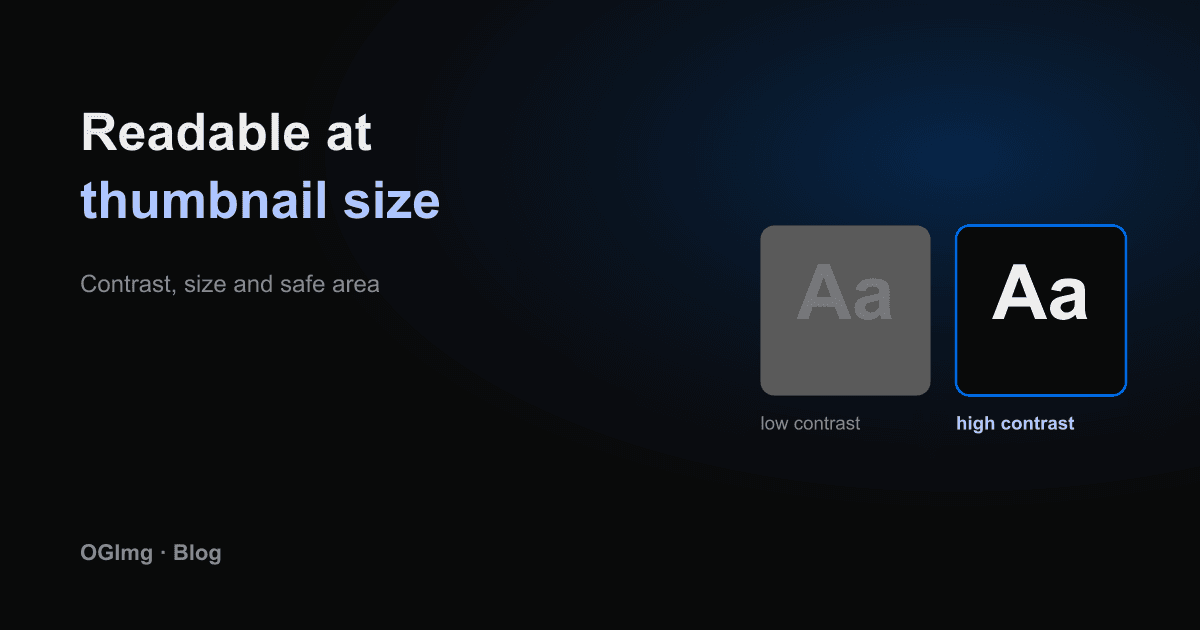
A link preview is seen at a very different size from the image you designed it on. On a phone in a busy feed, a 1200 pixel wide card is shown at roughly a third of that width. Text that looked comfortable on your monitor becomes unreadable, and a subtle gradient turns into mud. Designing for the small version is the only way to make the picture work.
Text size
Make the title large enough to read at thumbnail size. As a rule, the headline should be among the biggest things on the card and short enough to fit in two lines at most. If a title needs three lines, shorten the title for the image rather than shrinking the type until it becomes a texture.
The secondary text is the first thing to disappear. Keep it to one short line or drop it entirely. The title and the brand are the parts the reader needs to recognise.
Contrast
Light text on a busy photo is hard to read at any size. Put a solid or near-solid panel behind the text, or use a dark overlay that is strong enough to keep the letters clear. Aim for a contrast ratio of at least 4.5 to 1 between the title and its background, the same threshold used for normal text in the WCAG guidelines.
Safe area
Keep important content away from the edges. Platforms crop, round corners and sometimes overlay a play button or a domain label. A margin of about 80 pixels on every side protects the title and the logo from being clipped.
Alt text and the page
Social platforms mostly ignore alt text, but it still matters for two reasons. Screen readers announce the image on your own page, and the text forces you to say what the image is for. If an image has no meaning on its own, it is probably decoration, and decoration does not belong in a preview.
- Write alt text that describes the purpose, for example "Preview card for the pricing page", not every detail of the artwork.
- Check the image at 300 pixels wide, the size many feeds use on mobile, before you publish it.
- Avoid text that is only in the background, such as a faint watermark, because it will be lost completely.